Brand identity Design
Logo and Visual identity for Contraste
The project overview
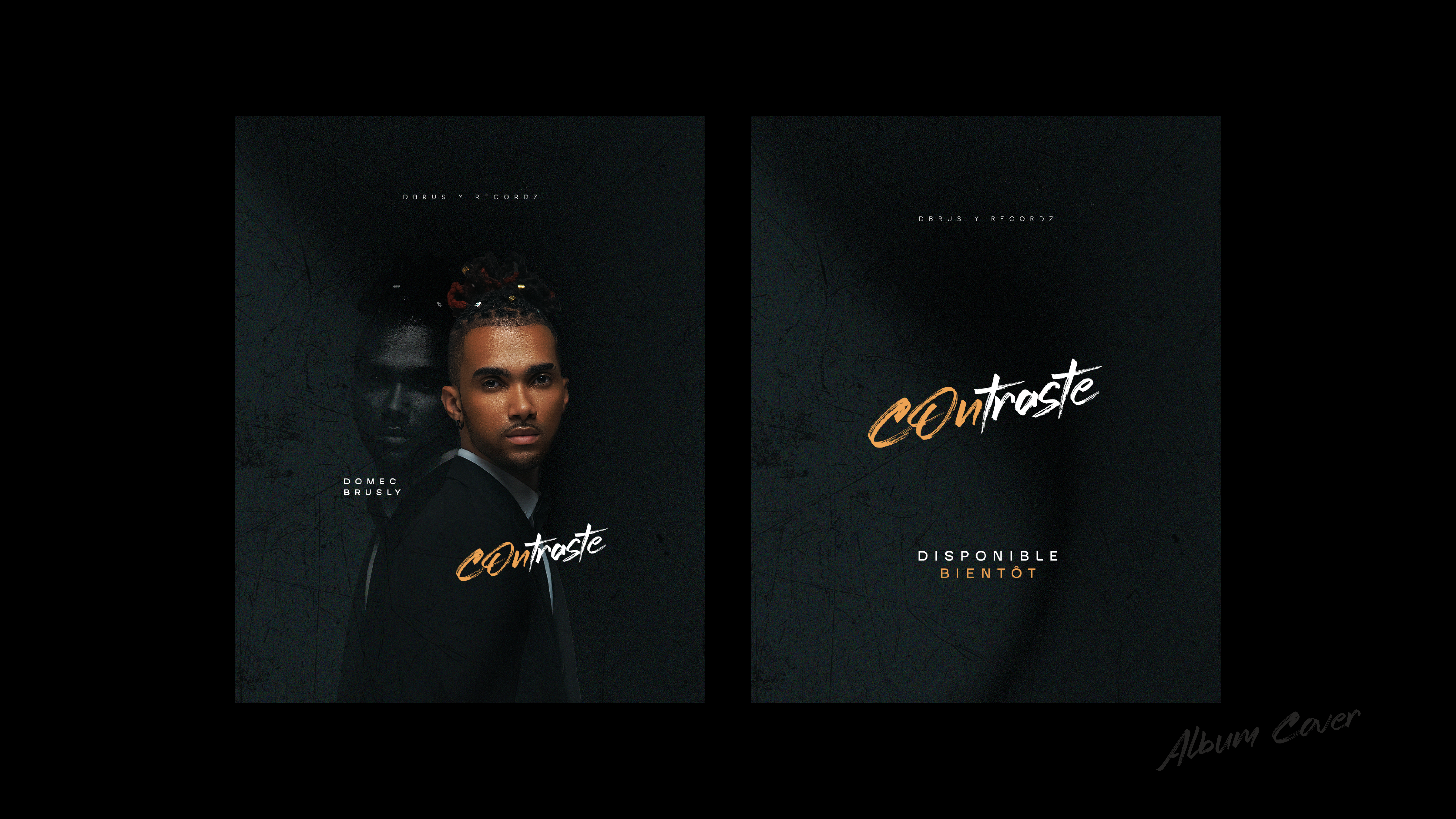
CONTRASTE is a visual identity built around duality, tension, and self-expression. The project explores the contrast between light and dark, softness and strength, simplicity and boldness, reflecting the emotional depth and artistic direction of the album.
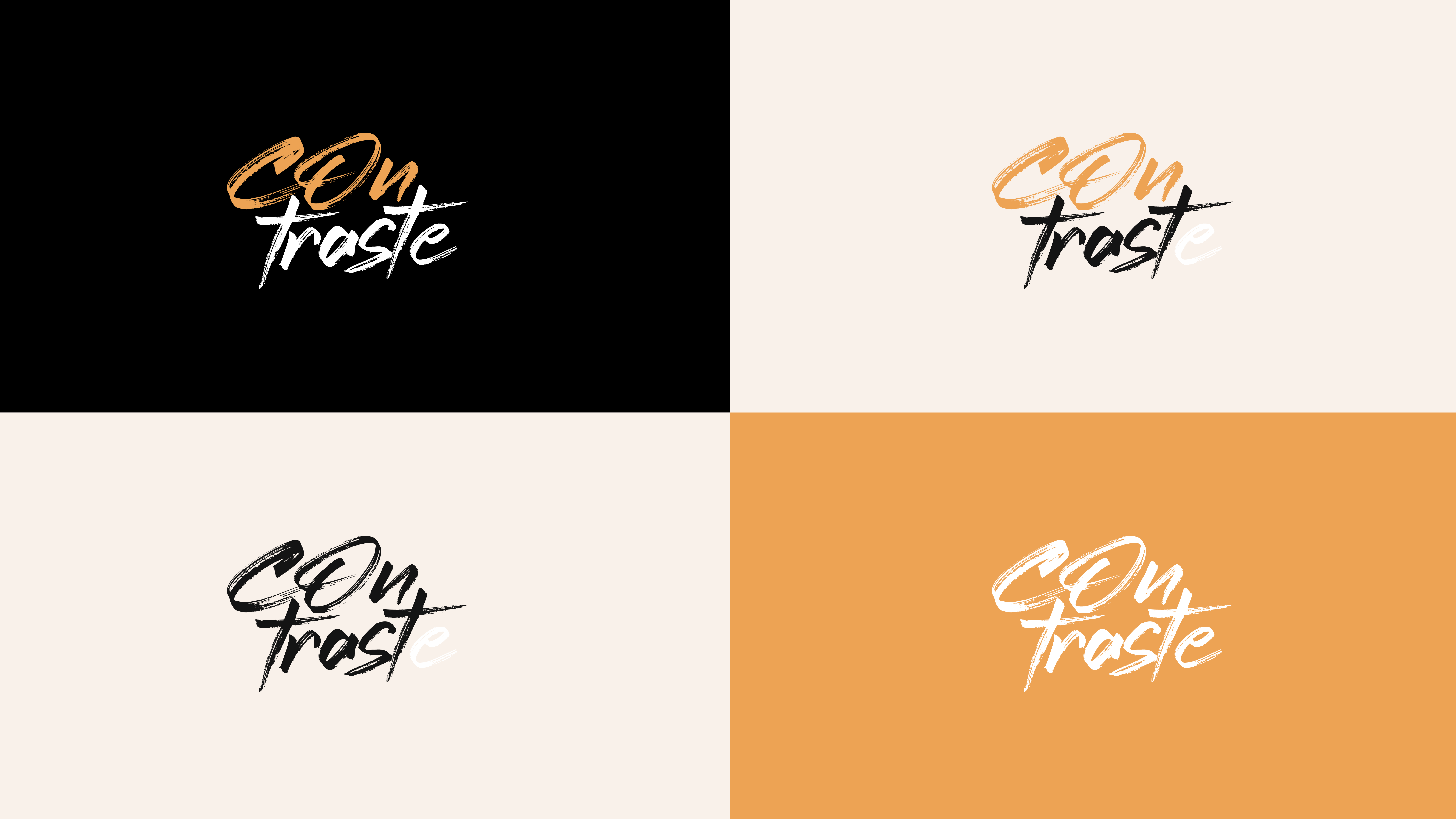
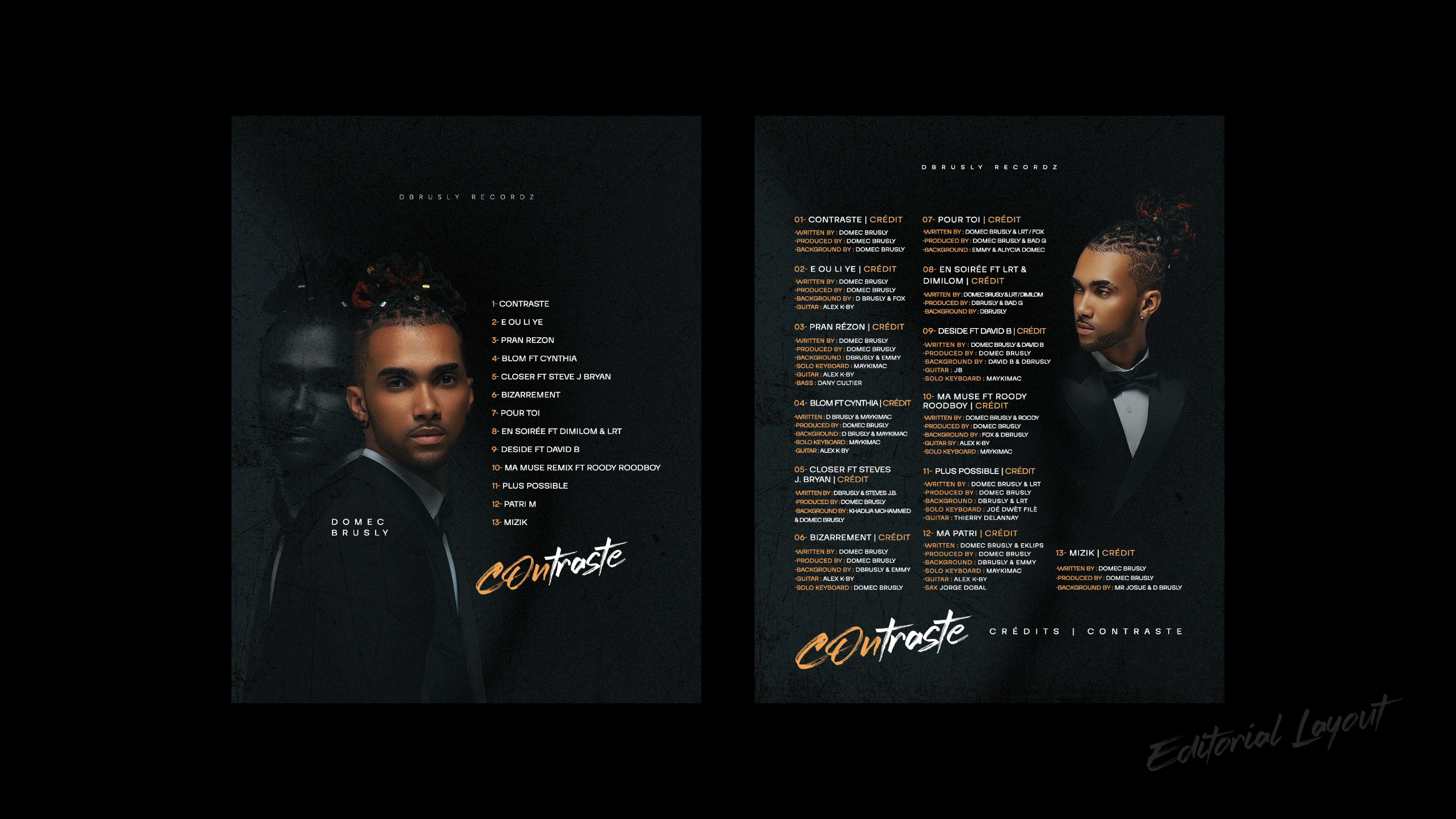
The branding combines a refined, minimalist foundation with expressive typography and a warm gold accent, symbolizing identity, value, and individuality. The handwritten logotype introduces a human, raw energy, while the structured layouts create balance and clarity.
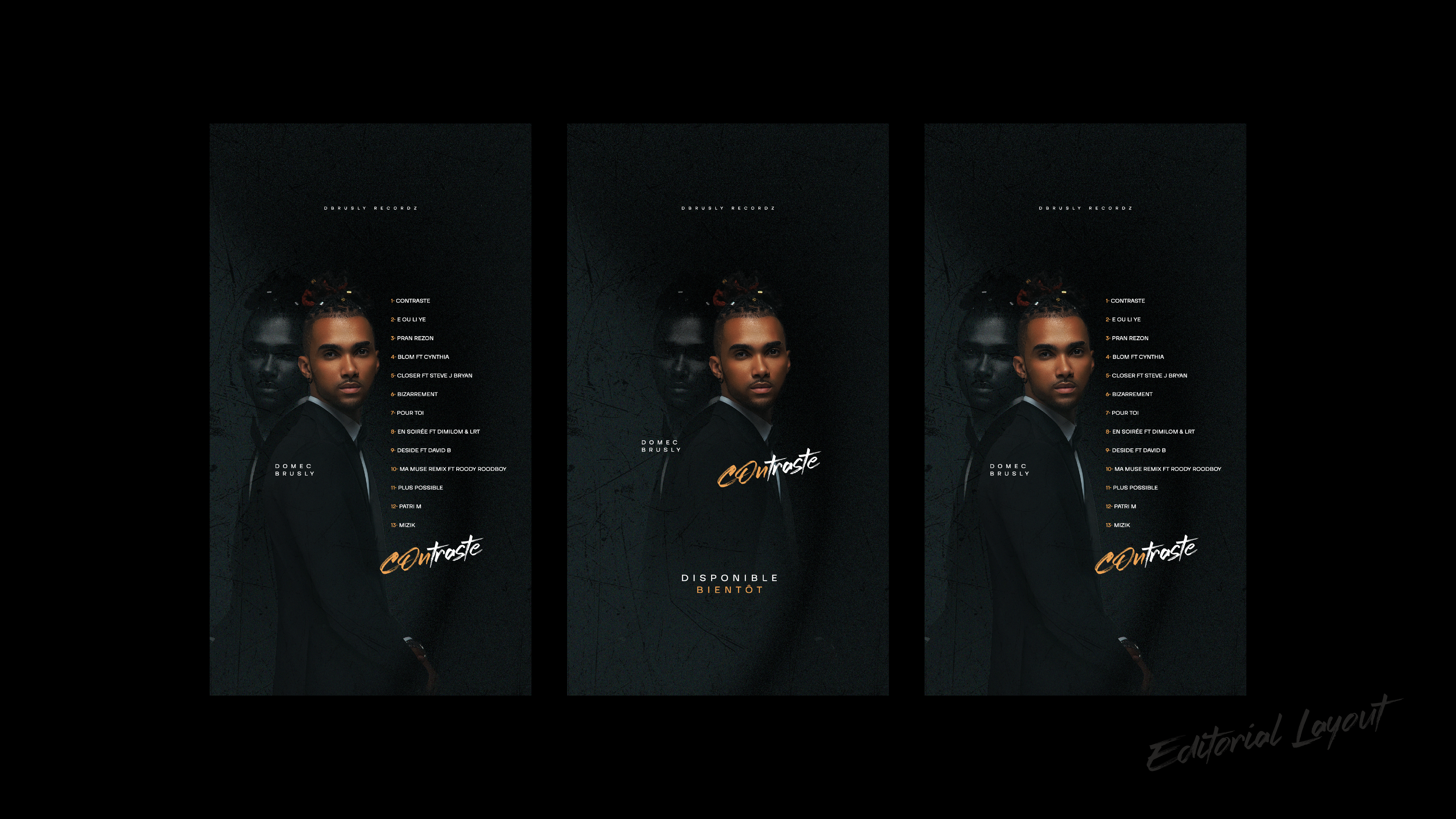
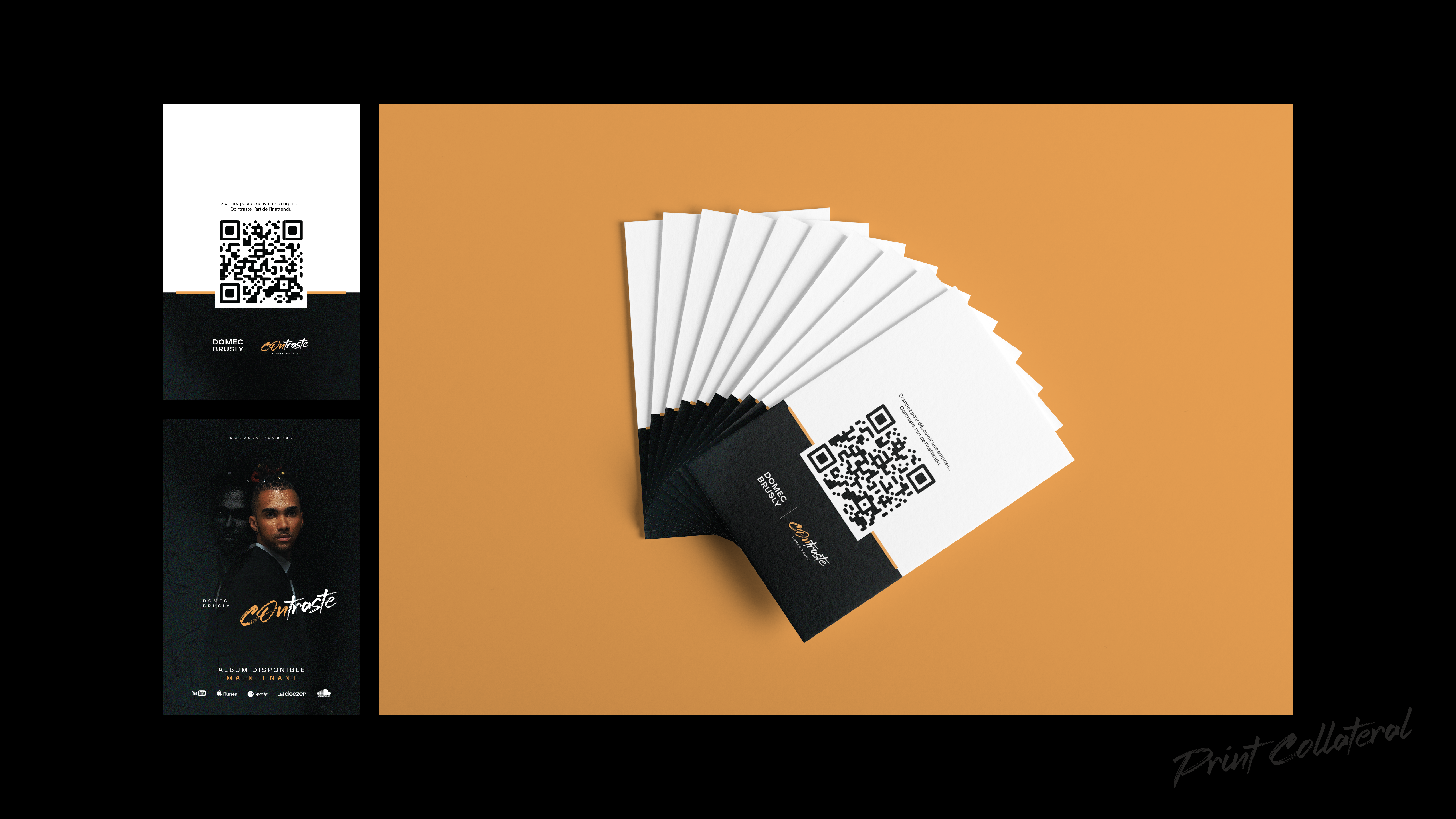
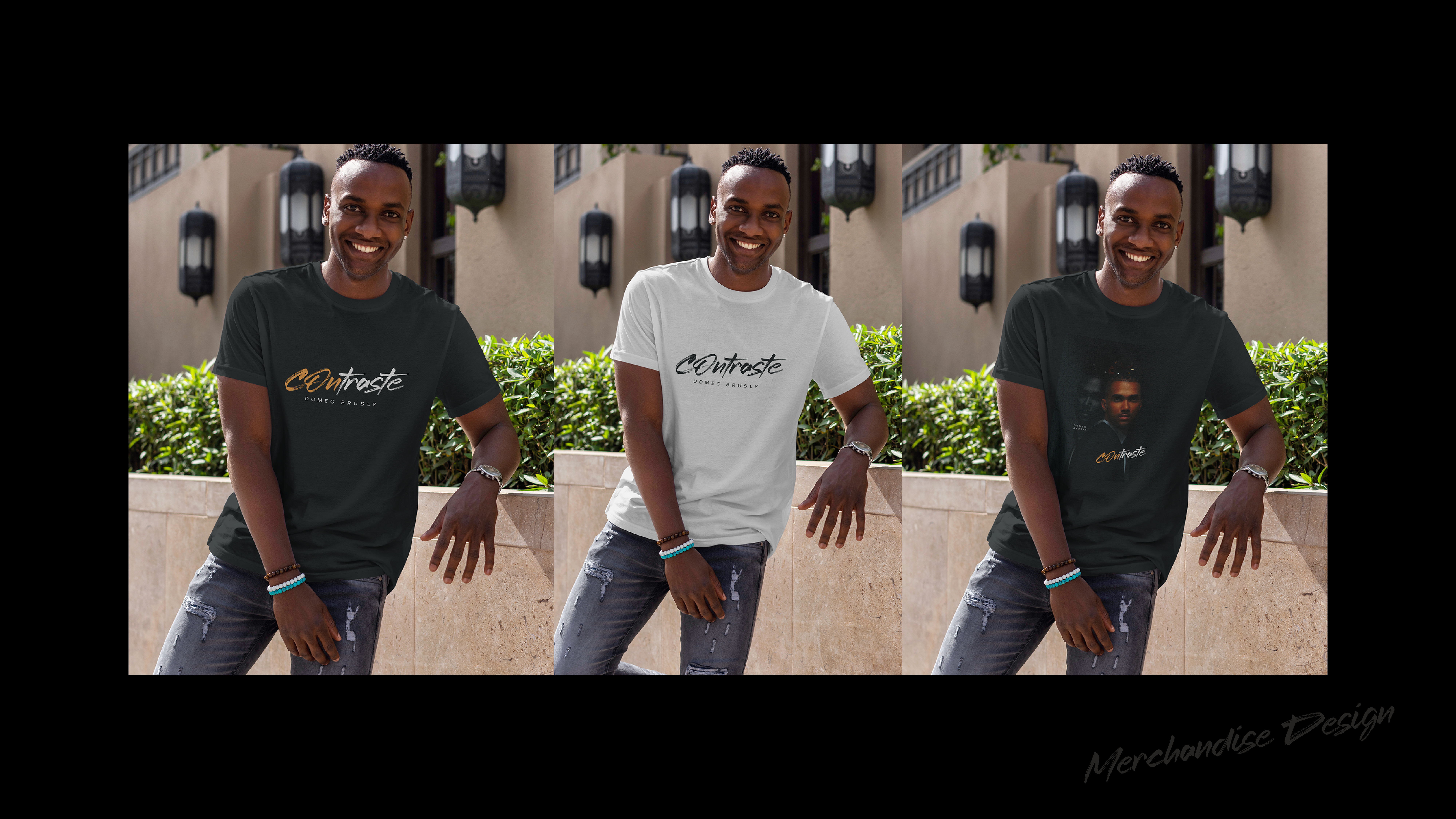
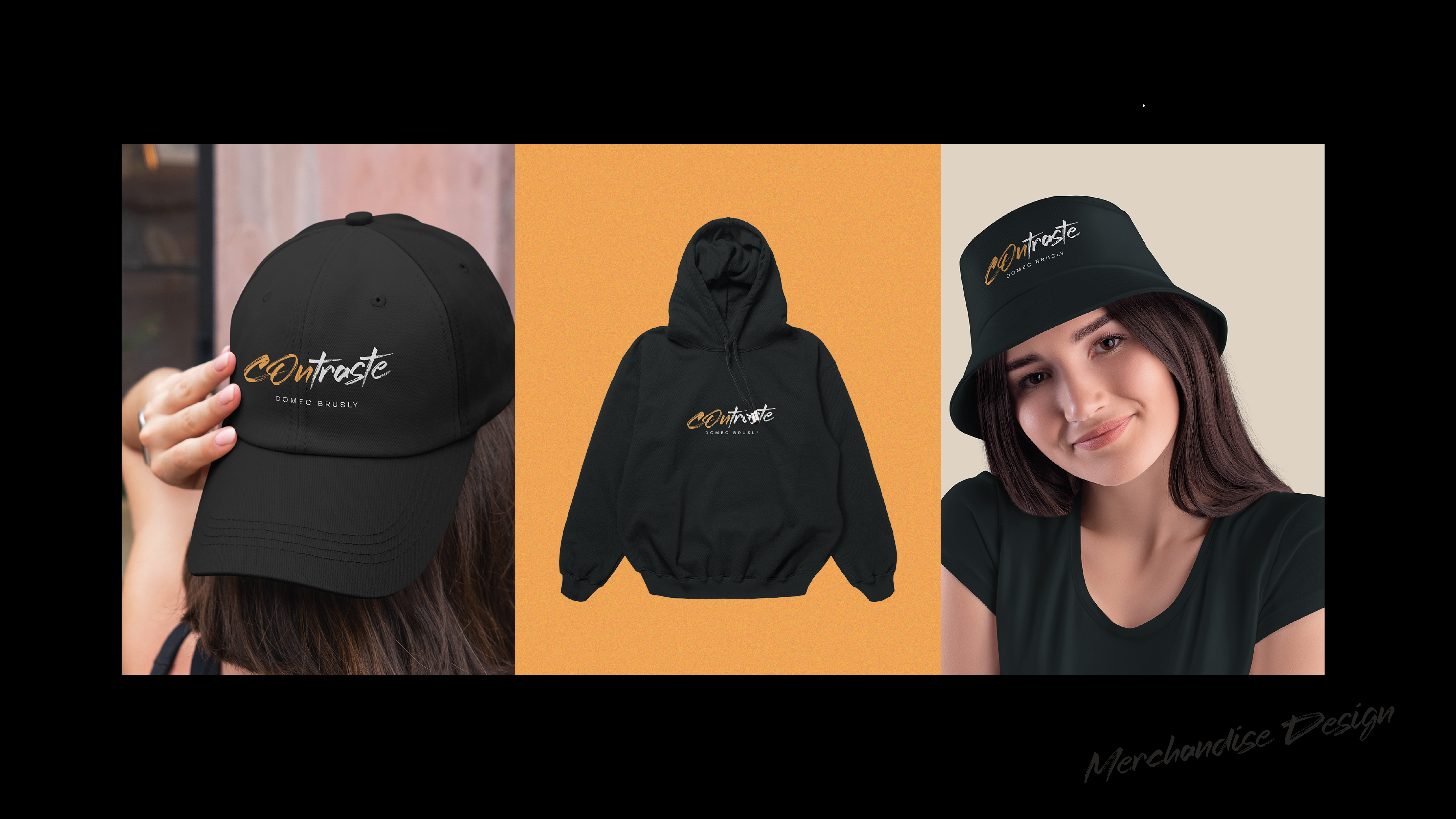
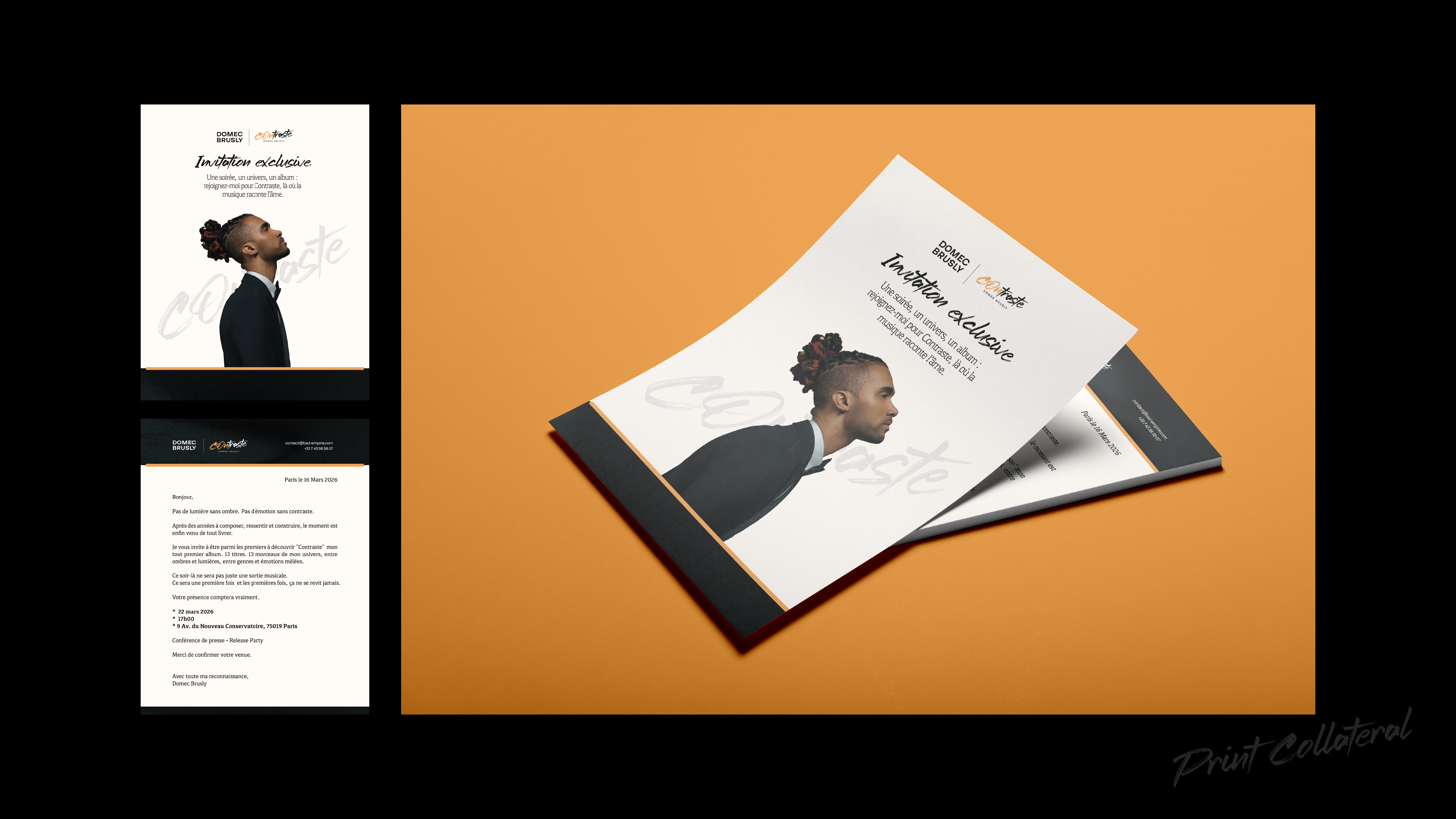
Through cohesive visuals across print, digital, and merchandise, the project establishes a strong, recognizable universe, one that feels both intimate and premium. CONTRASTE is not just a name, but a visual narrative of opposing forces coexisting in harmony.