Back
20/01/25
Logo Design
Logo Design For Satelit

The project overview
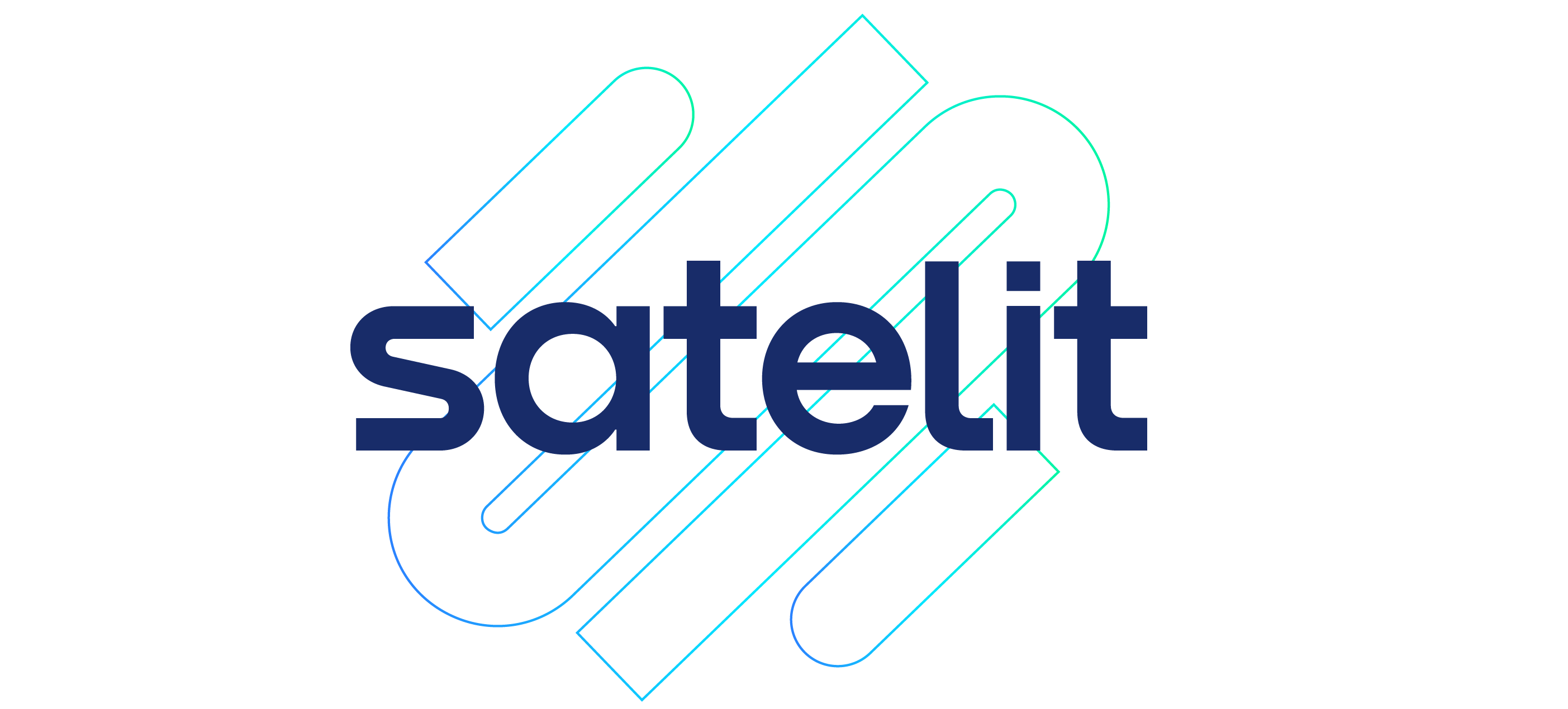
The SATELIT logo embodies the spirit of a business accelerator that helps high-potential ventures grow, build strong foundations, and reach new heights. The slanted “S”-shaped symbol evokes an upward trajectory: the path of the businesses SATELIT propels toward success. Its continuous lines represent connection, collaboration, and movement, all essential elements for fostering and advancing an innovation ecosystem. The blue-to-green gradient symbolizes technology, trust, and the energy of progress, while the rounded, lowercase typography conveys modernity, approachability, and simplicity.


Brand identity Design
Next