Logo and Visual identity
Logo and and Visual Identity for Rebuild Her Foundation
The project overview
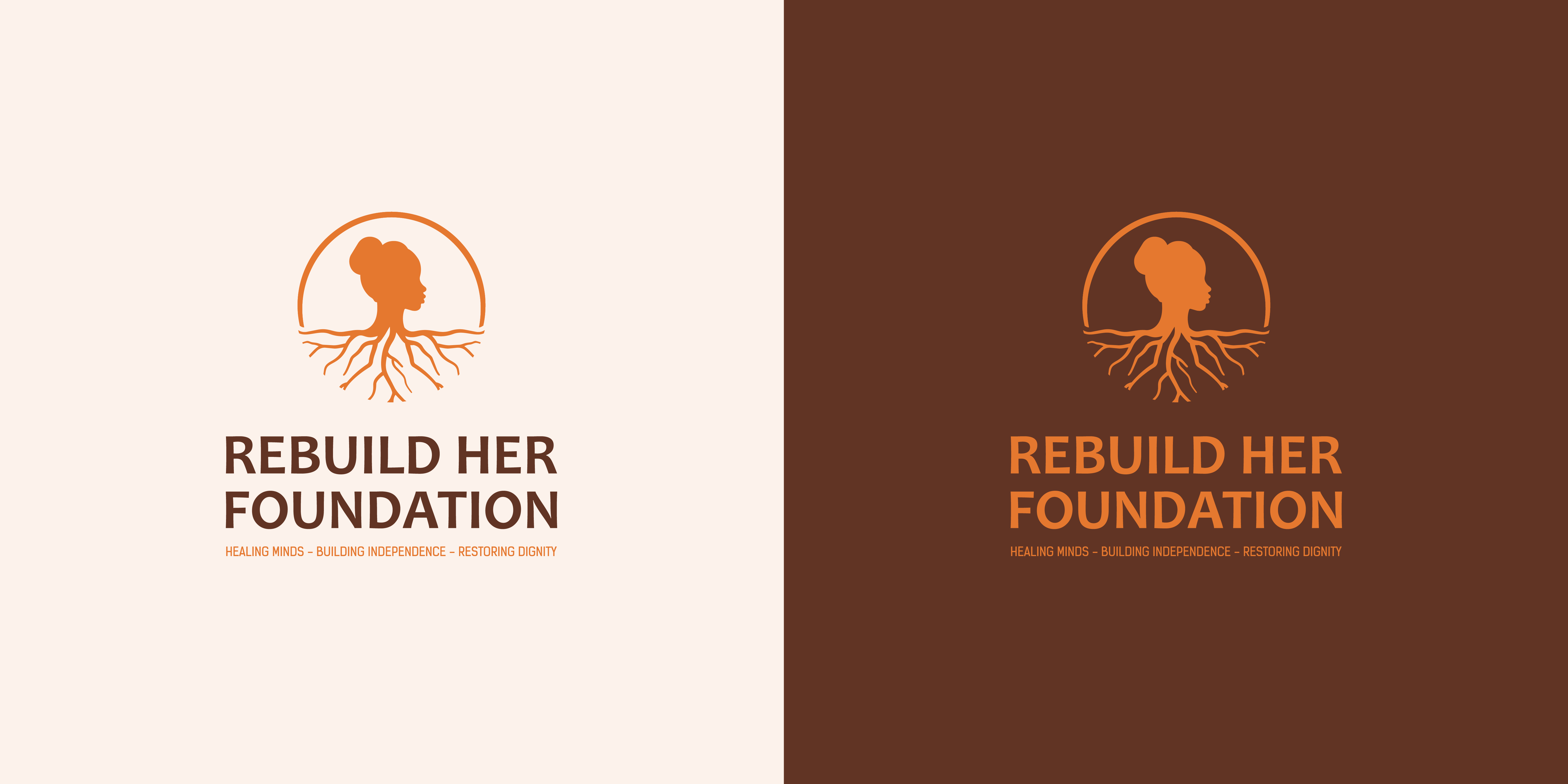
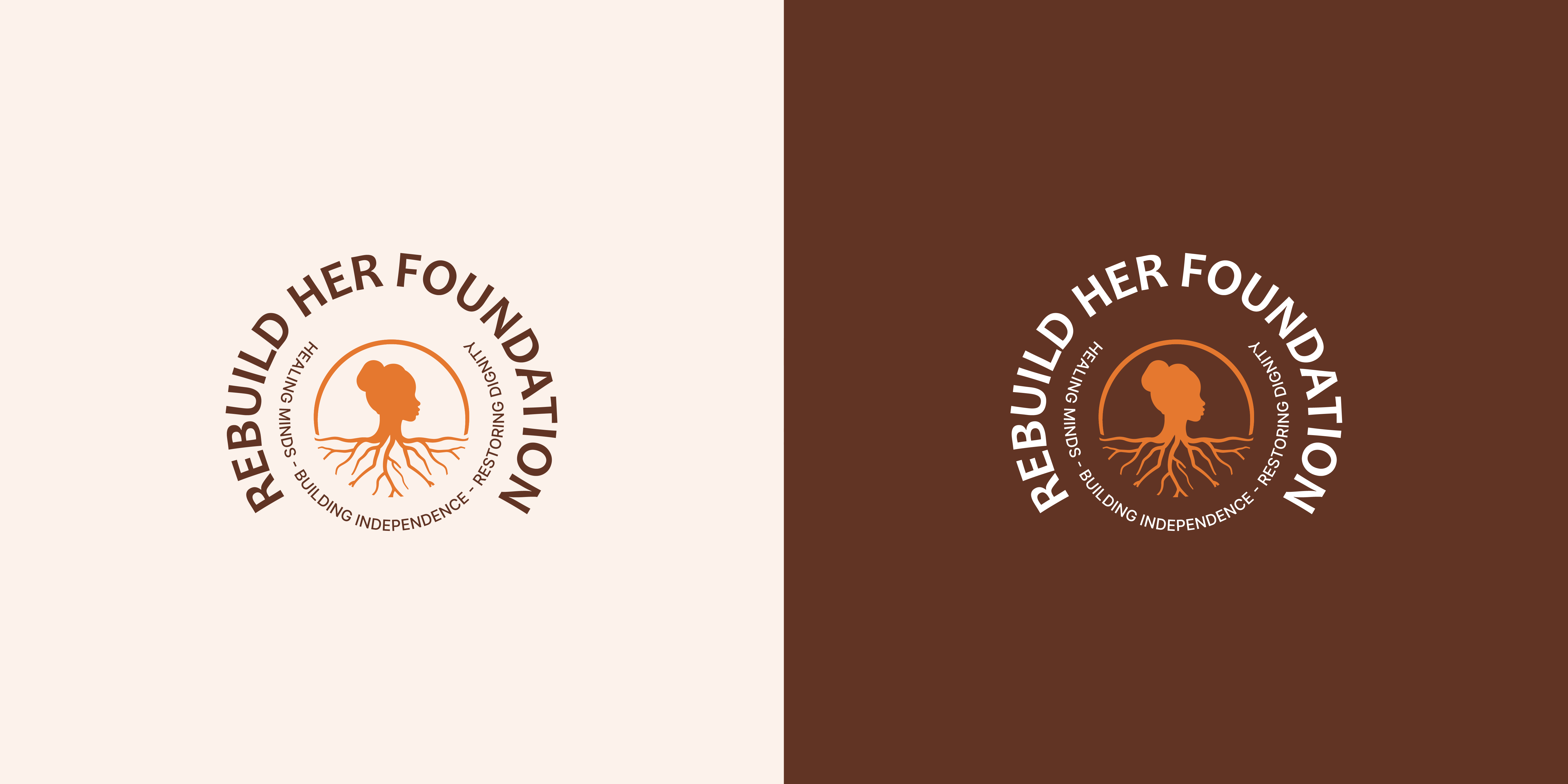
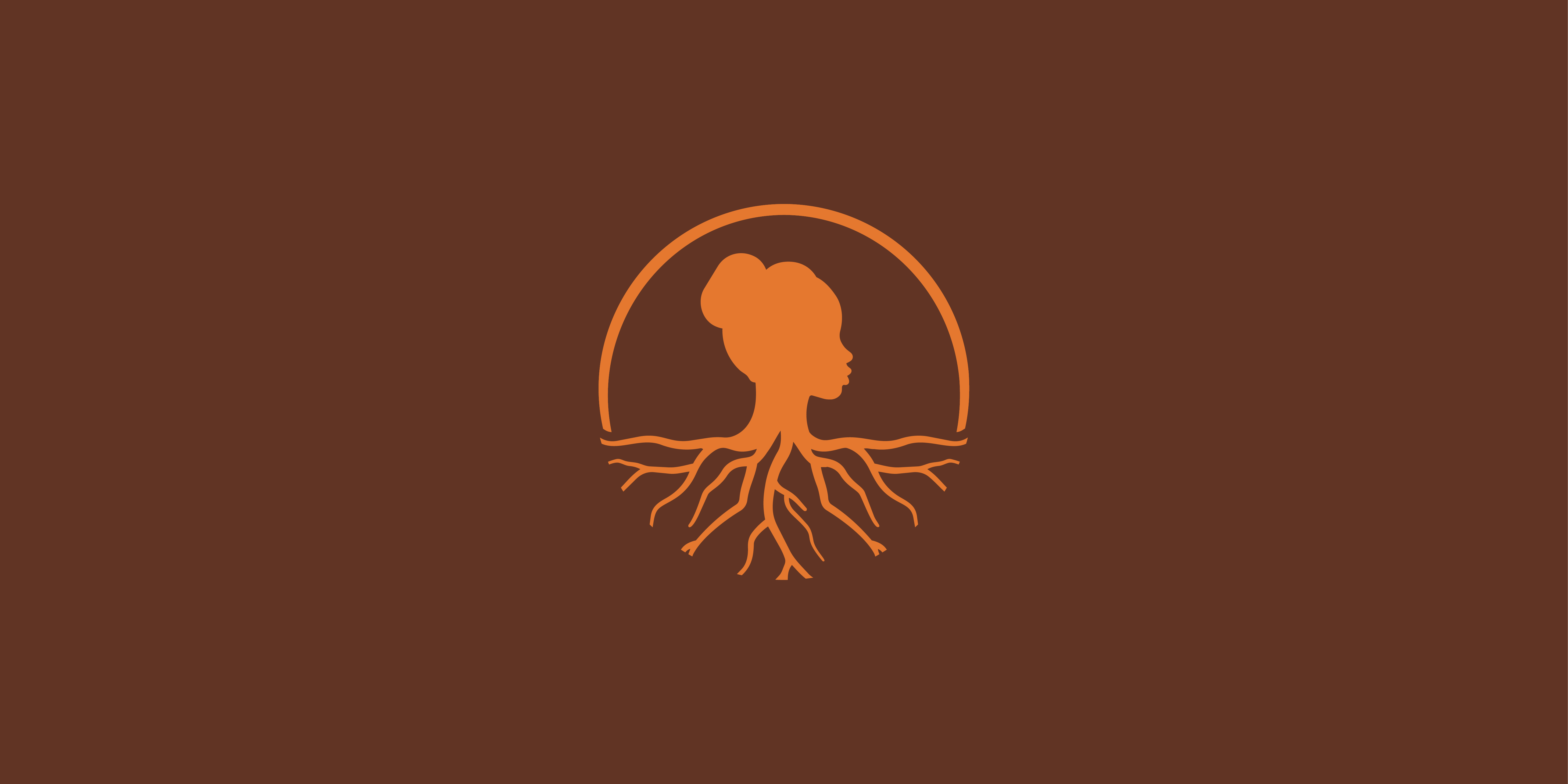
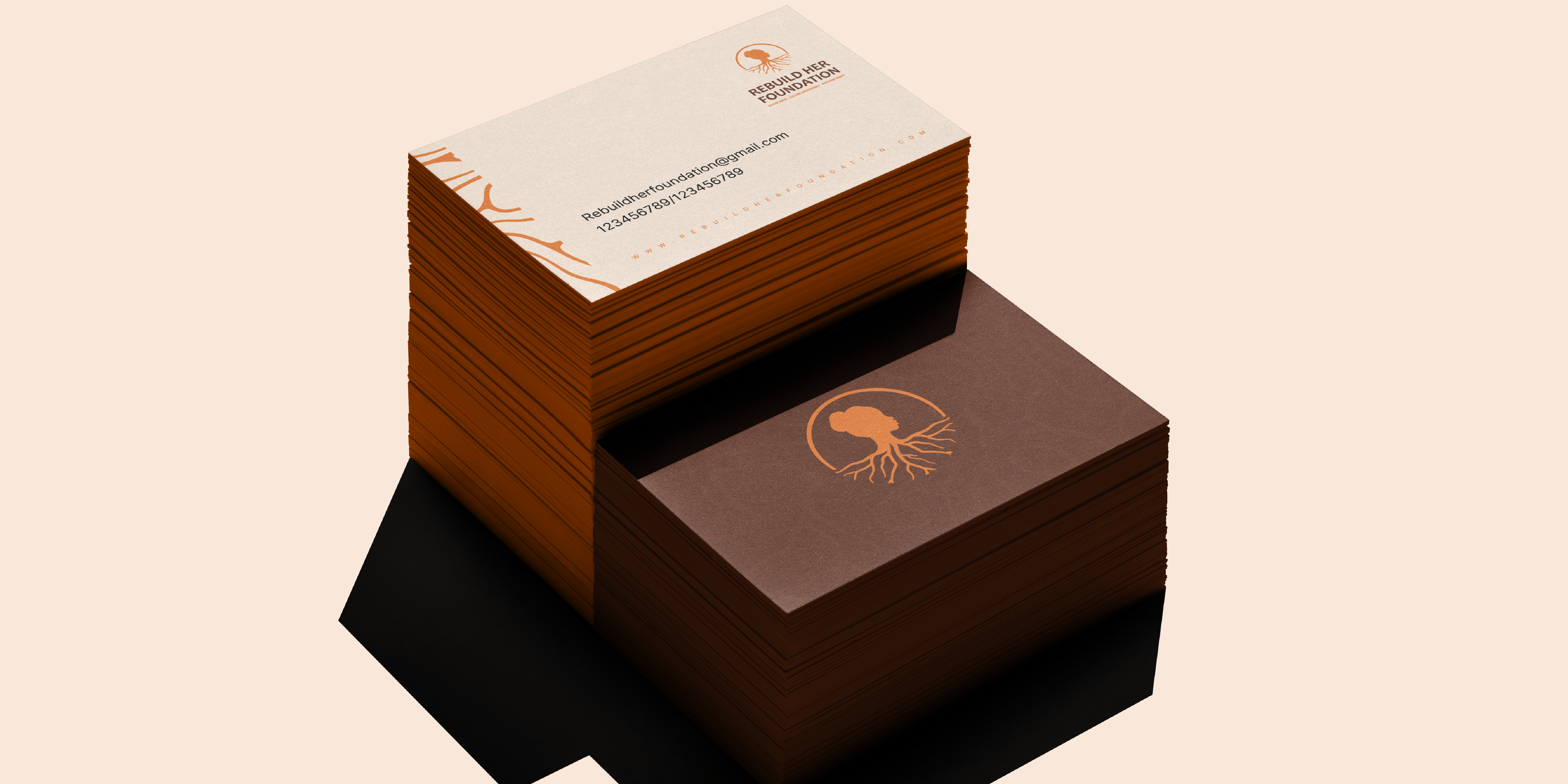
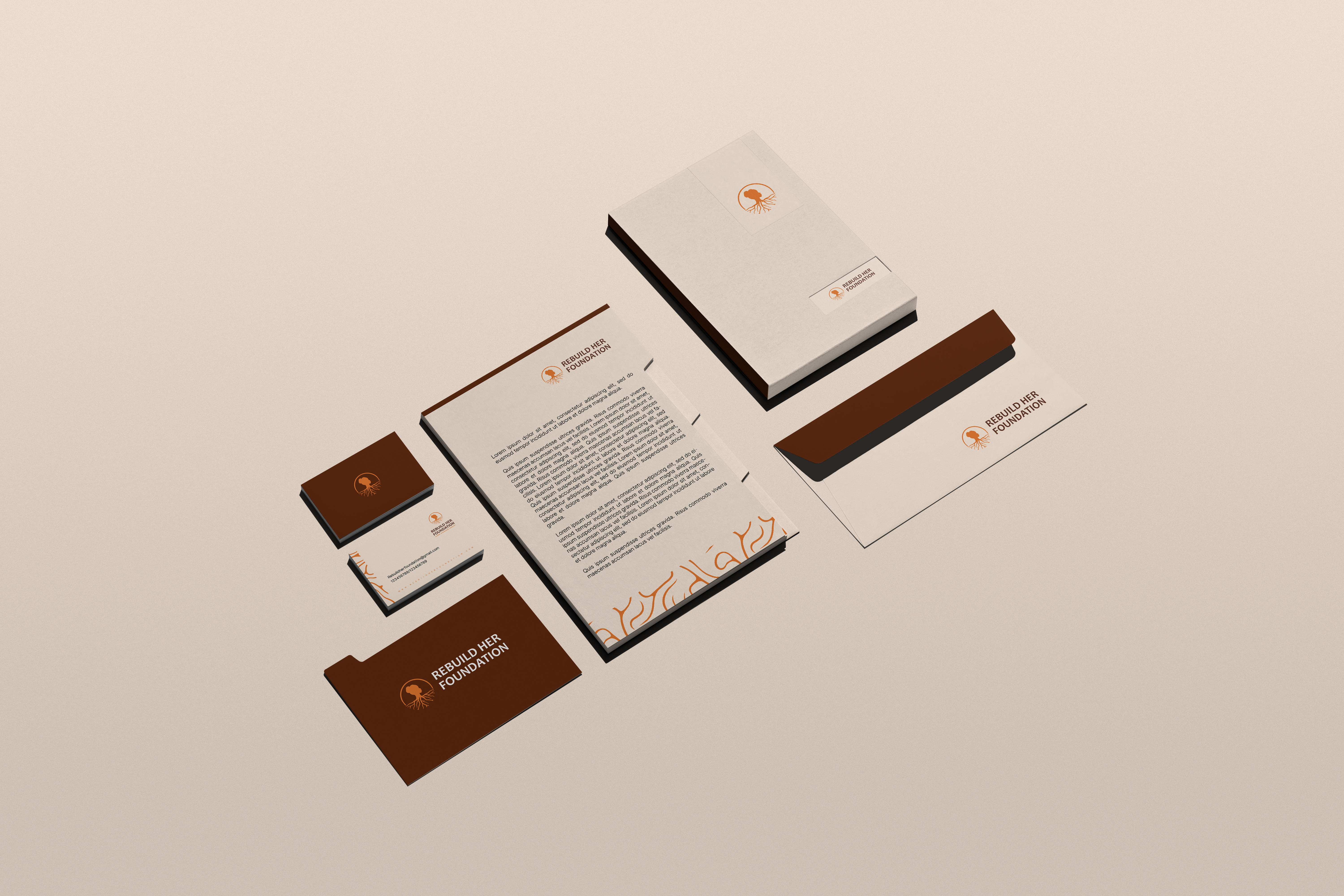
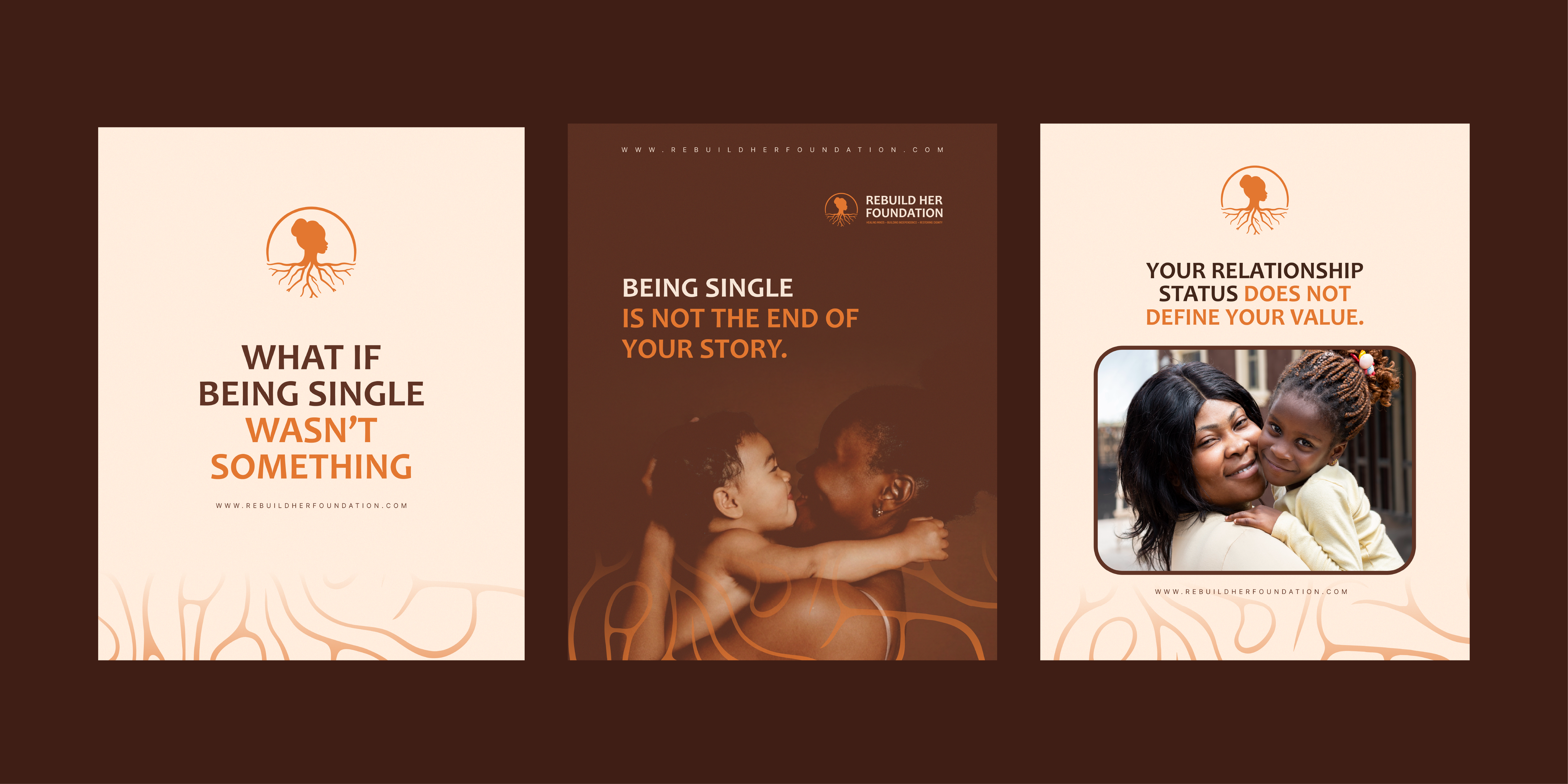
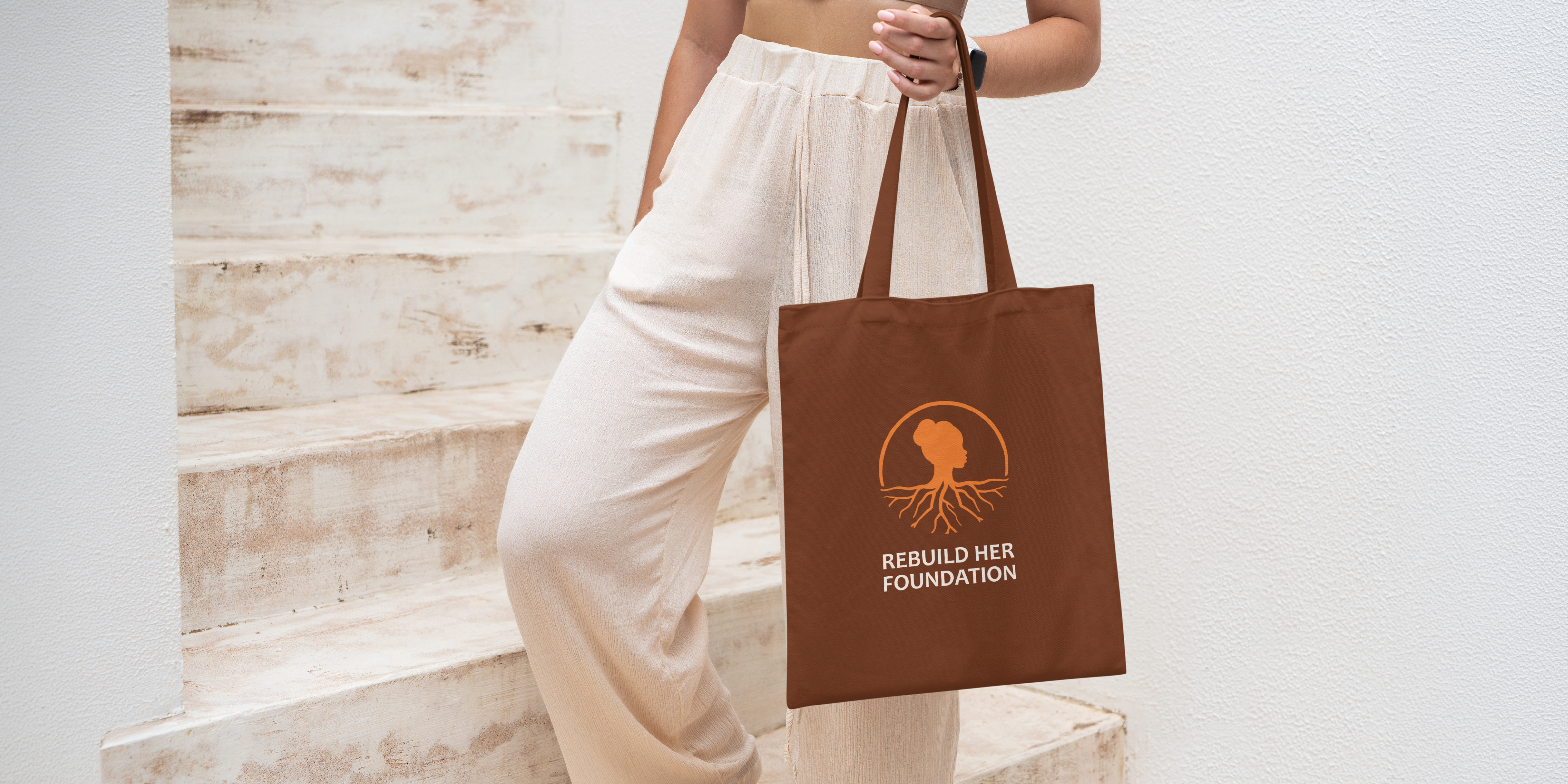
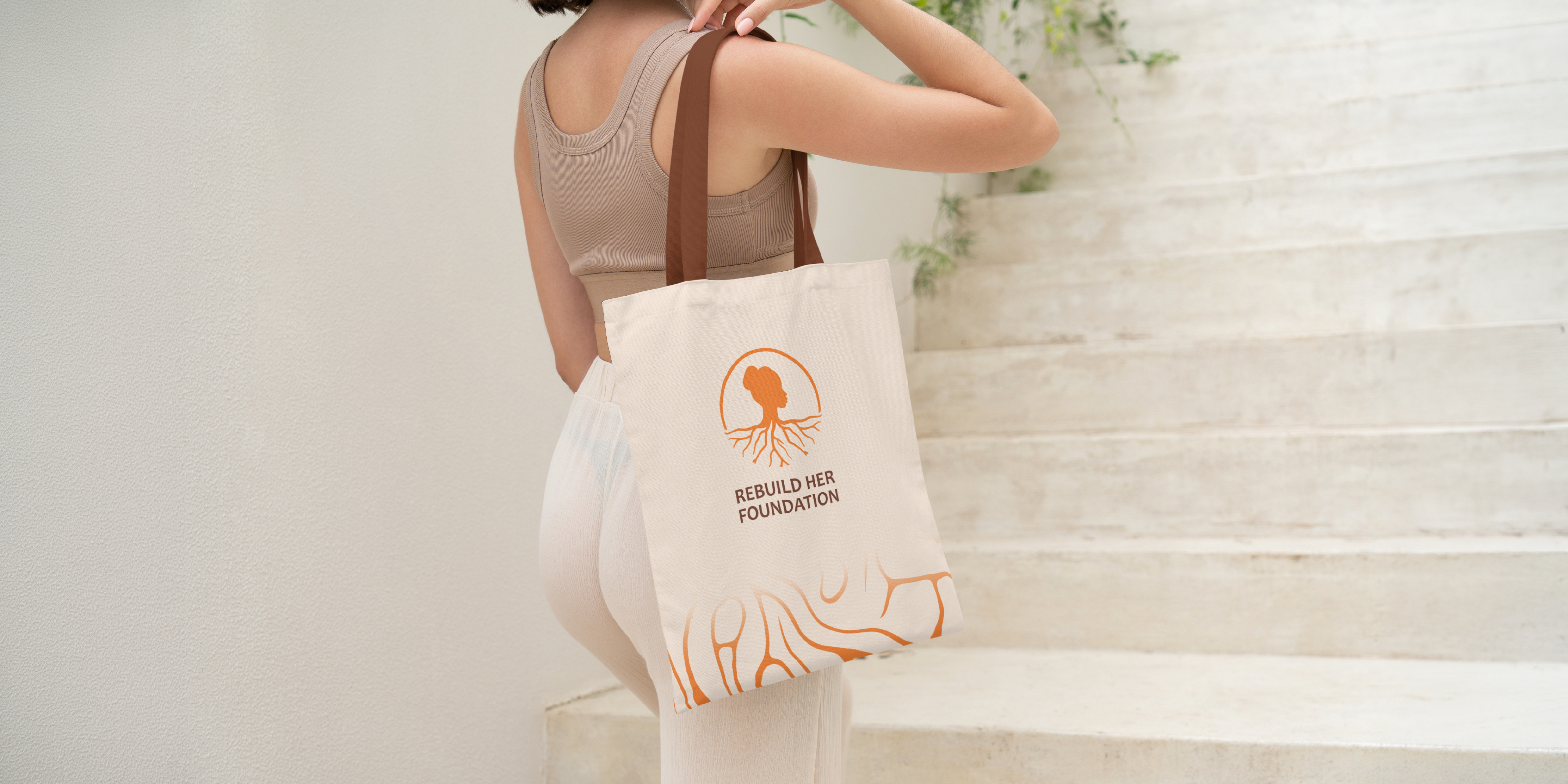
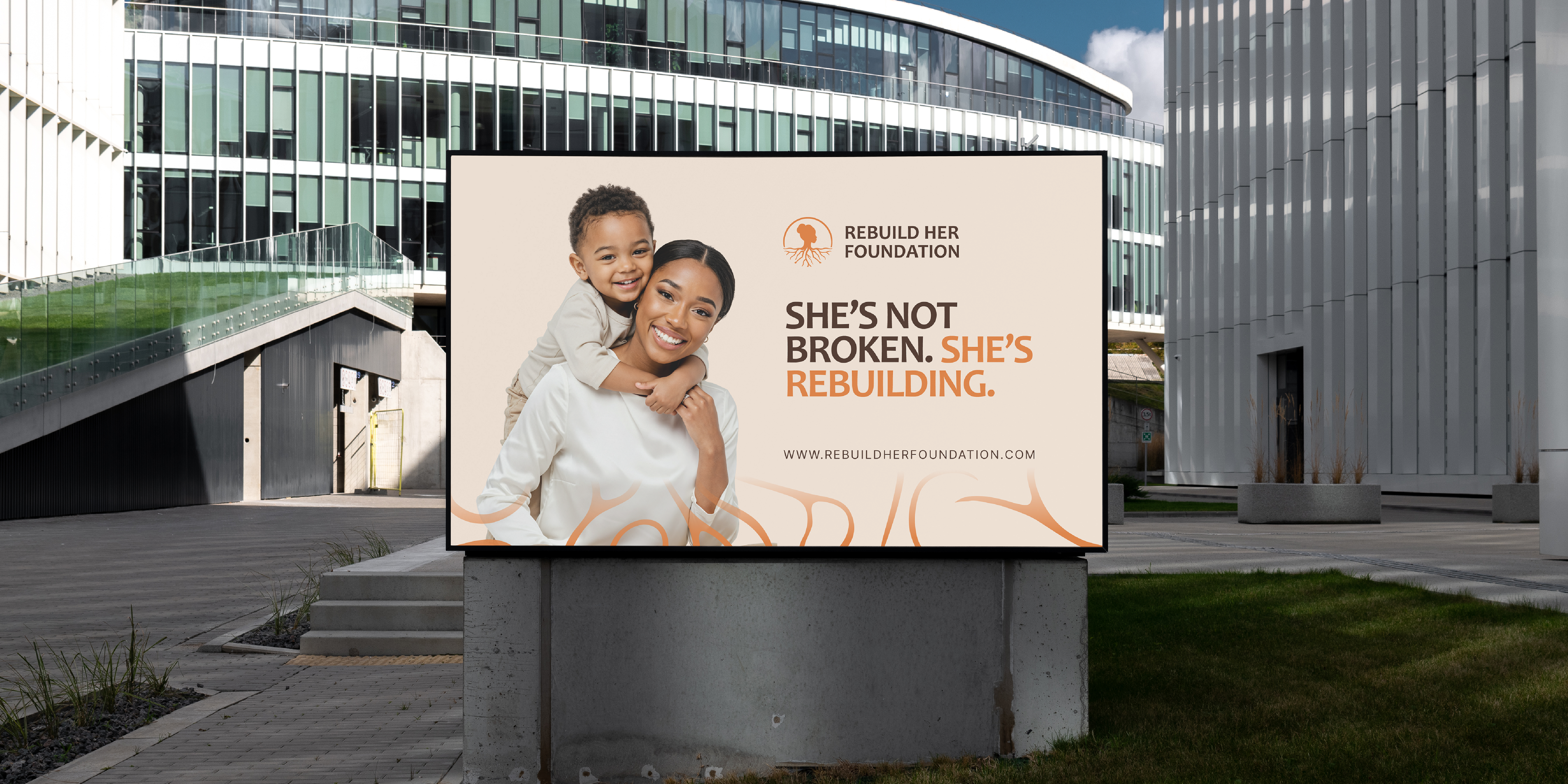
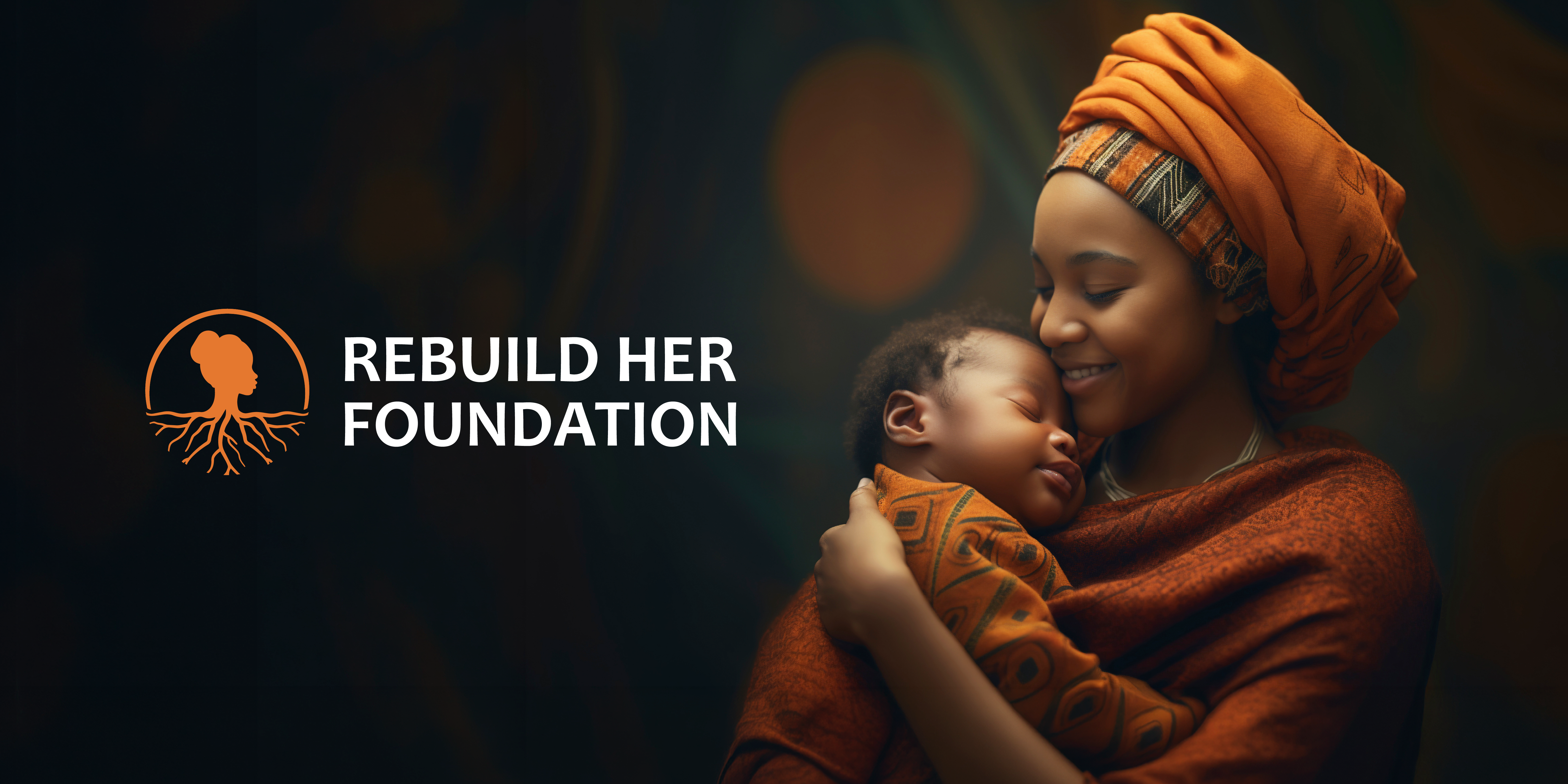
The REBUILD HER FOUNDATION visual identity is built around the idea of a woman reconnecting with her roots and rebuilding from within. The logo combines a feminine silhouette with a circular form and organic roots, symbolizing identity, protection, stability, healing, and personal growth. The roots represent the emotional and personal foundations that allow her to grow stronger, while the circle creates a sense of wholeness, safety, and community.
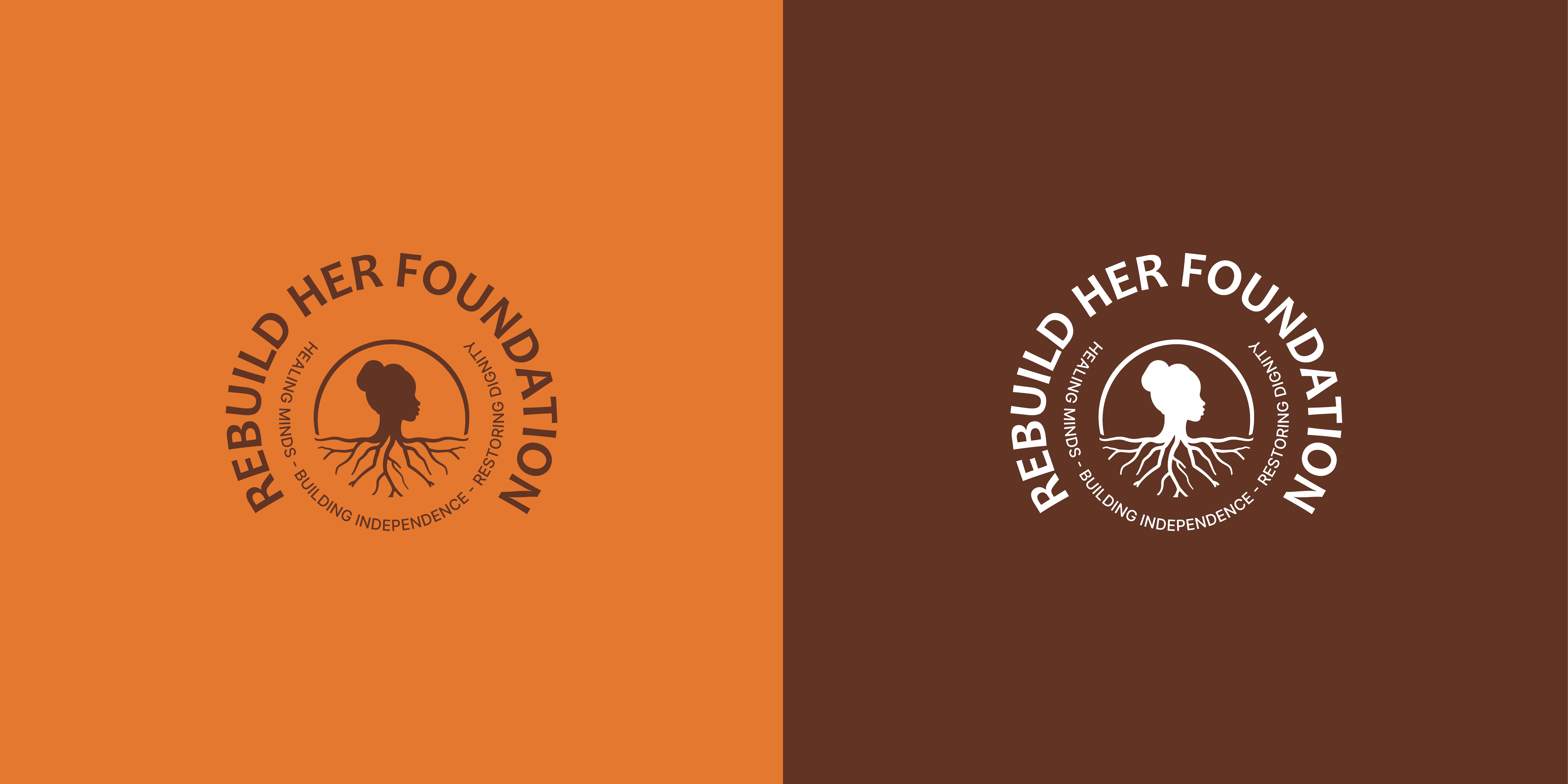
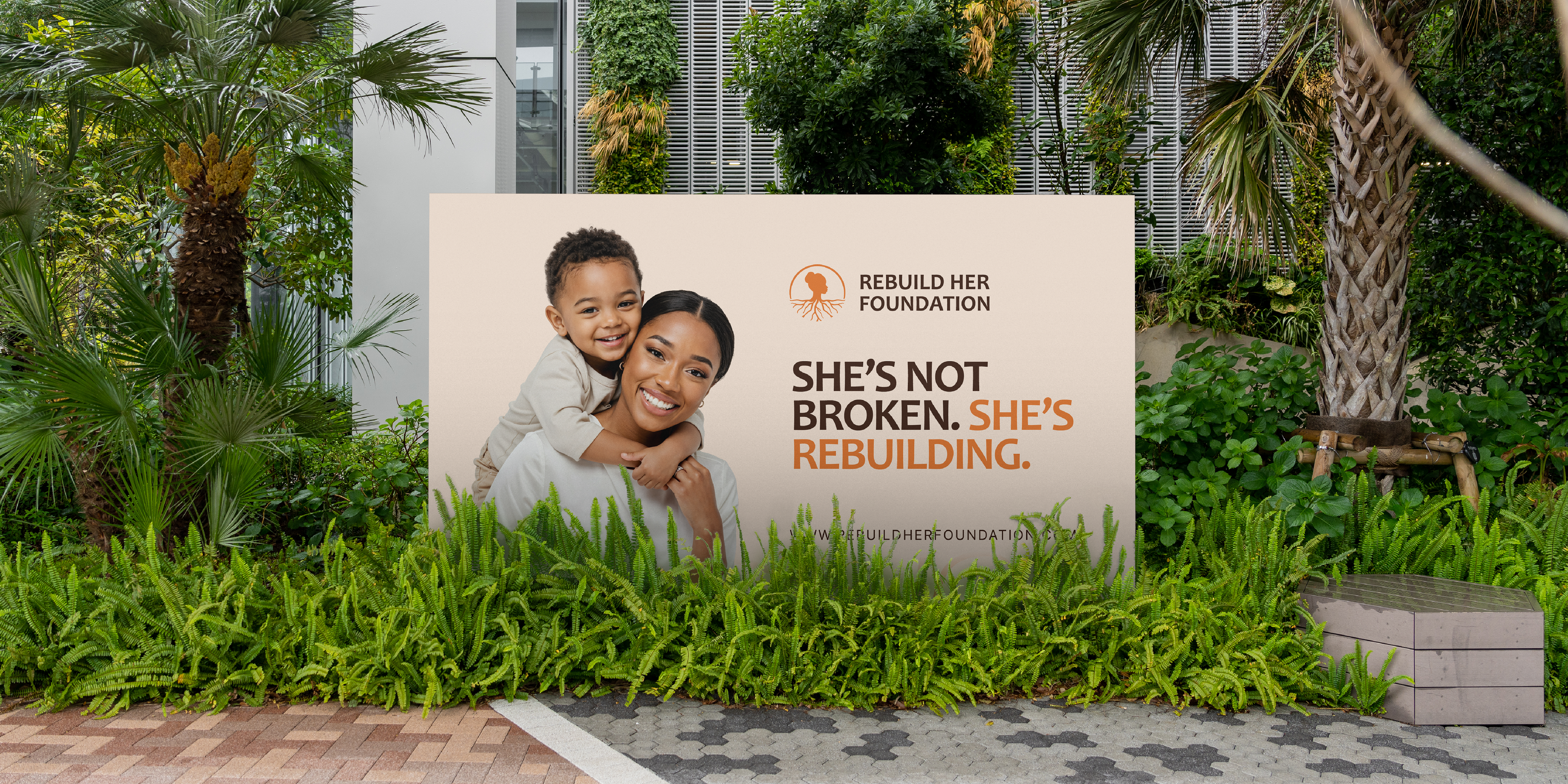
The visual system uses a warm and grounded palette of deep brown, vibrant orange, and soft ivory, creating a balance between strength, warmth, femininity, and hope. Bold typography gives the identity confidence and presence, while the organic root motif adds a human and nurturing quality. Together, these elements create a visual language that feels empowering, mature, authentic, and restorative, reflecting the brand’s belief that when a woman strengthens her foundation, she can grow again.